index.wxml
<!--wxml-->
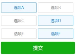
<view class='wrap'>
<view class='checkbox-con'>
<checkbox-group bindchange="checkboxChange">
<label class="{{item.checked?'checkbox checked':'checkbox'}}" wx:for="{{checkboxArr}}" bindtap='checkbox' data-index="{{index}}" wx:key="item.name">
<checkbox value="{{item.name}}" checked="{{item.checked}}"/>{{item.name}}
</label>
</checkbox-group>
<button type='primary' bindtap='confirm'>提交</button>
</view>
</view>
index.js
Page({
  data: {
  checkboxArr: [{
   name: '选项A',
   checked: false
  }, {
   name: '选项B',
   checked: false
  }, {
   name: '选项C',
   checked: false
  }, {
   name: '选项D',
   checked: false
  }, {
   name: '选项E',
   checked: false
  }, {
   name: '选项F',
   checked: false
  }],
  },
  checkbox: function (e) {
  var index = e.currentTarget.dataset.index;//获取当前点击的下标
  var checkboxArr = this.data.checkboxArr;//选项集合
  checkboxArr[index].checked = !checkboxArr[index].checked;//改变当前选中的checked值
  this.setData({
   checkboxArr: checkboxArr
  });
  },
  checkboxChange: function (e) {
  var checkValue = e.detail.value;
  this.setData({
   checkValue: checkValue
  });
  },
  confirm: function() {// 提交
  console.log(this.data.checkValue)//所有选中的项的value
  },
 })
index.wxss
.wrap{
  width: 550rpx;
  margin: 50rpx auto
 }

 .checkbox-con{
  margin-top: 40rpx;
  text-align: center
 }
 .checkbox{
  width: 260rpx;
  height: 72rpx;
  line-height: 72rpx;
  font-size: 28rpx;
  color: #888888;
  border: 1rpx solid #CECECE;
  border-radius: 5rpx;
  display: inline-block;
  margin: 0 10rpx 20rpx 0;
  position: relative
 }
 .checked{
  color: #1A92EC;
  background: rgba(49,165,253,0.08);
  border: 1rpx solid #31A5FD;
 }
 .checkbox checkbox{
  display: none
 }
 .checked-img{
  width: 28rpx;
  height: 28rpx;
  position: absolute;
  top: 0;
  right: 0
 }
模拟实现单选框
index2.wxml
<!--wxml--><view class='wrap'>
 <view class='checkbox-con'>
 <radio-group bindchange="radioChange">
  <label class="{{item.checked?'checkbox checked':'checkbox'}}" wx:for="{{checkboxArr}}" bindtap='radio' data-index="{{index}}" wx:key="item.name">
  <checkbox value="{{item.name}}" checked="{{item.checked}}"/>{{item.name}}  </label>
 </radio-group>
  <button type='primary' bindtap='confirm'>提交</button>
 </view></view>
index2.js
Page({
 data: {
 checkboxArr: [{
  name: '选项A',
  checked: false
 }, {
  name: '选项B',
  checked: false
 }, {
  name: '选项C',
  checked: false
 }, {
  name: '选项D',
  checked: false
 }, {
  name: '选项E',
  checked: false
 }, {
  name: '选项F',
  checked: false
 }],
 },
 radio: function (e) {
 var index = e.currentTarget.dataset.index;//获取当前点击的下标
 var checkboxArr = this.data.checkboxArr;//选项集合
 if (checkboxArr[index].checked) return;//如果点击的当前已选中则返回
 checkboxArr.forEach(item => {
  item.checked = false
 })
 checkboxArr[index].checked = true;//改变当前选中的checked值
 this.setData({
  checkboxArr: checkboxArr
 });
 },
 radioChange: function (e) {
 var checkValue = e.detail.value;
 this.setData({
  checkValue: checkValue
 });
 },
 confirm: function() {// 提交
 console.log(this.data.checkValue)//所有选中的项的value
 },
})
index2.wxss
.wrap{
  width: 550rpx;
  margin: 50rpx auto
 }

 .checkbox-con{
  margin-top: 40rpx;
  text-align: center
 }
 .checkbox{
  width: 260rpx;
  height: 72rpx;
  line-height: 72rpx;
  font-size: 28rpx;
  color: #888888;
  border: 1rpx solid #CECECE;
  border-radius: 5rpx;
  display: inline-block;
  margin: 0 10rpx 20rpx 0;
  position: relative
 }
 .checked{
  color: #1A92EC;
  background: rgba(49,165,253,0.08);
  border: 1rpx solid #31A5FD;
 }
 .checkbox checkbox{
  display: none
 }
 .checked-img{
  width: 28rpx;
  height: 28rpx;
  position: absolute;
  top: 0;
  right: 0
 }
来源:https://www.cnblogs.com/wuli-cxr/p/8963726.html
