首先大家都知道小程序自带的swiper工具是有默认高度的,所以在实际开发中高度自适应的实现是必修课,比较简单的实现高度自适应的方法是利用scroll-view工具。
选项卡工具swiper高度自适应和按钮位置固定的时候,会导致按钮即便设置了fixed属性也会跟随scroll-view的滑动改变位置;
解决思路:让按钮既在swiper-item中,又不能随scroll-view变化,同时让选项卡标题fixed在页面顶部
方法:在swiper-item中嵌套一个scroll-view
改进:单纯的嵌套一个scroll-view会导致选项卡内容无无法显示,在scroll-view和他上层的swiper中添加style="height: {{clientHeight?clientHeight+'px':'auto'}}"高度属性
index.wxml
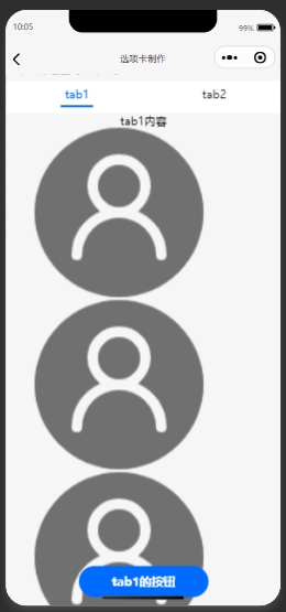
<view class='ticket-container'>
<!--选项卡Tab布局-->
<view class='title'>
      <view class="{{0 == currentIndex ? 'title-sel-selected' : 'title-sel'}}" bindtap='titleClick' data-idx='0'>
      <text>tab1</text>
      <hr class="line-style" />
      </view>
      <view class="{{1 == currentIndex ? 'title-sel-selected' : 'title-sel'}}" bindtap='titleClick' data-idx='1'>
      <text>tab2</text>
      <hr class="line-style" />
      </view>
</view>
<!--内容布局-->
<swiper style="height: {{clientHeight?clientHeight+'px':'auto'}}"   class='swiper' bindchange='pagechange' current='{{currentIndex}}'>
    <swiper-item class='swiper'>
    <scroll-view scroll-y style="height: {{clientHeight?clientHeight+'px':'auto'}}" >
    <view style="text-align:center">tab1内容</view>
    <image src="/images/avatar.png" mode="aspectFit"></image>
    <image src="/images/avatar.png" mode="aspectFit"></image>
    <image src="/images/avatar.png" mode="aspectFit"></image>
    </scroll-view>
<view class="image_detail">
    <button class="btn">
    <text>tab1的按钮</text>
    </button>
</view>
</swiper-item>
<swiper-item class='swiper'>
<scroll-view scroll-y style="height: {{clientHeight?clientHeight+'px':'auto'}}" >
    <view>tab2内容</view>
</scroll-view>
<view class="image_detail">
    <button  class="btn">
    <text>tab2的按钮</text>
    </button>
</view>
</swiper-item>
</swiper>
</view>
index.js
// const app = getApp()
// const util = require('../../utils/util.js')

Page({
  data: {
  currentIndex:0
},
//swiper切换时会调用
pagechange: function(e) {
  // console.log(e)
  this.setData({
    currentIndex: e.detail.current
  })
},

//用户点击tab时调用
titleClick: function(e) {
  this.setData({
    //拿到当前索引并动态改变
    currentIndex: e.currentTarget.dataset.idx
  })
},
onLoad: function(options) {
  var that=this
  //获取高度
  wx.getSystemInfo({
    success: function (res) {
        that.setData({
            clientHeight: res.windowHeight
        });
    }
})
wx.showShareMenu({
  withShareTicket: true
})
wx.setNavigationBarTitle({ title: '选项卡制作' })

}
})
index.wxss
.table {
  border: 0px solid darkgray;
  padding-bottom: 230rpx;
}

.title {
  width: 100%;
  height: 88rpx;
  background: white;
  display: flex;
  align-items: center;
  justify-content: space-around;
  margin-top: 20rpx;
}
.title-sel {
  color: #24272c;
  font-size: 32rpx;
  display: flex;
  flex-direction: column;
  align-items: center;
}
.title-sel  .line-style {
  background: #fff;
  height: 6rpx;
  width: 40rpx;
  position: relative;
  margin-top: 10rpx;
}
.title-sel-selected {
  color: #006bff;
  font-size: 32rpx;
  display: flex;
  flex-direction: column;
  align-items: center;
}
.title-sel-selected .line-style {
  background: #006bff;
  height: 6rpx;
  width: 90rpx;
  position: relative;
  margin-top: 10rpx;
}
.swiper {
  width: 100%;
  height: 100%;
  flex: 1;
  overflow: scroll;
  margin: 0 auto;
  /* position: relative; */
}
.ticket-container{
  position:fixed;
  top:0;
  width:100%;
}
.image_detail {
  display: flex;
  flex-direction: column;
  width: 100%;
  text-align: center;
  align-items: center;
  justify-content: center;
  vertical-align: middle;
  margin-top: 10rpx;
  margin-bottom: 10rpx;
  background-color: #f1f1f1;
}
/*按钮设计*/
.btn {
  margin-top: 25px;
  display: flex;
  align-items: center;
  justify-content: center;
  width: 100px;
  border-radius: 30px;
  background: #006bff;
  color: white;
  padding: 20rpx 50rpx;
  position: fixed;
  bottom: 130rpx;
}
来源:https://www.cnblogs.com/xgxxx/p/13269373.html
