
HTML:
<view class="main">
<button class="btn-grad1">按钮一</button>
</view>

CSS:
.btn-grad1 {
background-image: linear-gradient(to right, #77A1D3 0%, #79CBCA  51%, #77A1D3  100%);
margin: 10px;
padding: 15px 45px;
text-align: center;
text-transform: uppercase;
transition: 0.5s;
background-size: 200% auto;
color: white;
box-shadow: 0 0 20px #eee;
border-radius: 10px;
display: block;
}
.btn-grad1:hover {
background-position: right center; /* change the direction of the change here */
color: #fff;
text-decoration: none;
}
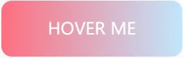
HTML:
<view class="main">
<button class="btn-grad2">按钮二</button>
</view>

CSS:
.btn-grad2 {
background-image: linear-gradient(to right, #ff6e7f 0%, #bfe9ff  51%, #ff6e7f  100%);
margin: 10px;
padding: 15px 45px;
text-align: center;
text-transform: uppercase;
transition: 0.5s;
background-size: 200% auto;
color: white;
box-shadow: 0 0 20px #eee;
border-radius: 10px;
display: block;
}
.btn-grad2:hover {
background-position: right center; /* change the direction of the change here */
color: #fff;
text-decoration: none;
}

HTML:
<view class="main">
<button class="btn-grad3">按钮三</button>
</view>

CSS:
.btn-grad3 {
background-image: linear-gradient(to right, #e52d27 0%, #b31217  51%, #e52d27  100%);
margin: 10px;
padding: 15px 45px;
text-align: center;
text-transform: uppercase;
transition: 0.5s;
background-size: 200% auto;
color: white;
box-shadow: 0 0 20px #eee;
border-radius: 10px;
display: block;
}

.btn-grad3:hover {
background-position: right center; /* change the direction of the change here */
color: #fff;
text-decoration: none;
}
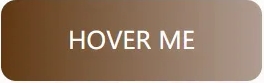
HTML:
<view class="main">
<button class="btn-grad4">按钮四</button>
</view>

CSS:
.btn-grad4 {
background-image: linear-gradient(to right, #603813 0%, #b29f94  51%, #603813  100%);
margin: 10px;
padding: 15px 45px;
text-align: center;
text-transform: uppercase;
transition: 0.5s;
background-size: 200% auto;
color: white;
box-shadow: 0 0 20px #eee;
border-radius: 10px;
display: block;
}

.btn-grad4:hover {
background-position: right center; /* change the direction of the change here */
color: #fff;
text-decoration: none;
}

HTML:
<view class="main">
<button class="btn-grad5">按钮五</button>
</view>

CSS:
.btn-grad5 {
background-image: linear-gradient(to right, #16A085 0%, #F4D03F  51%, #16A085  100%);
margin: 10px;
padding: 15px 45px;
text-align: center;
text-transform: uppercase;
transition: 0.5s;
background-size: 200% auto;
color: white;
box-shadow: 0 0 20px #eee;
border-radius: 10px;
display: block;
}

.btn-grad5:hover {
background-position: right center; /* change the direction of the change here */
color: #fff;
text-decoration: none;
}

HTML:
<view class="main">
<button class="btn-grad6">按钮六</button>
</view>

CSS:
.btn-grad6 {
background-image: linear-gradient(to right, #D31027 0%, #EA384D  51%, #D31027  100%);
margin: 10px;
padding: 15px 45px;
text-align: center;
text-transform: uppercase;
transition: 0.5s;
background-size: 200% auto;
color: white;
box-shadow: 0 0 20px #eee;
border-radius: 10px;
display: block;
}

.btn-grad6:hover {
background-position: right center; /* change the direction of the change here */
color: #fff;
text-decoration: none;
}
来源:https://developer.aliyun.com/article/1267650
